
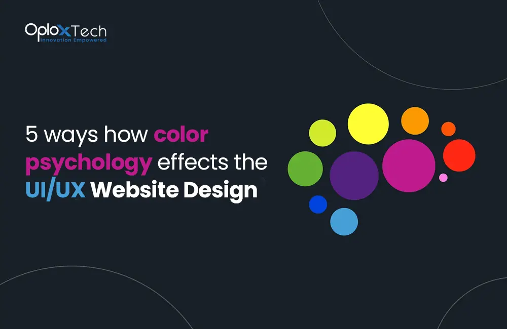
In the world of web design, every element plays a significant role in creating an engaging user experience. One such element that holds immense power is color. Color can evoke emotions, convey messages, and influence user behavior. When it comes to UI/UX website design, understanding color psychology becomes crucial. In this article, we will explore five ways color psychology impacts UI/UX website design, enabling designers to create visually appealing and user-friendly websites.
Color Psychology Affecting the UI/UX Website Design
In the realm of UI/UX website design, color holds immense power in shaping user perceptions, emotions, and overall user experience. Understanding the principles of color psychology and leveraging its effects can significantly enhance the effectiveness of a website design. Let’s explore five ways color psychology impacts UI/UX website design.
1. Understanding Color Psychology
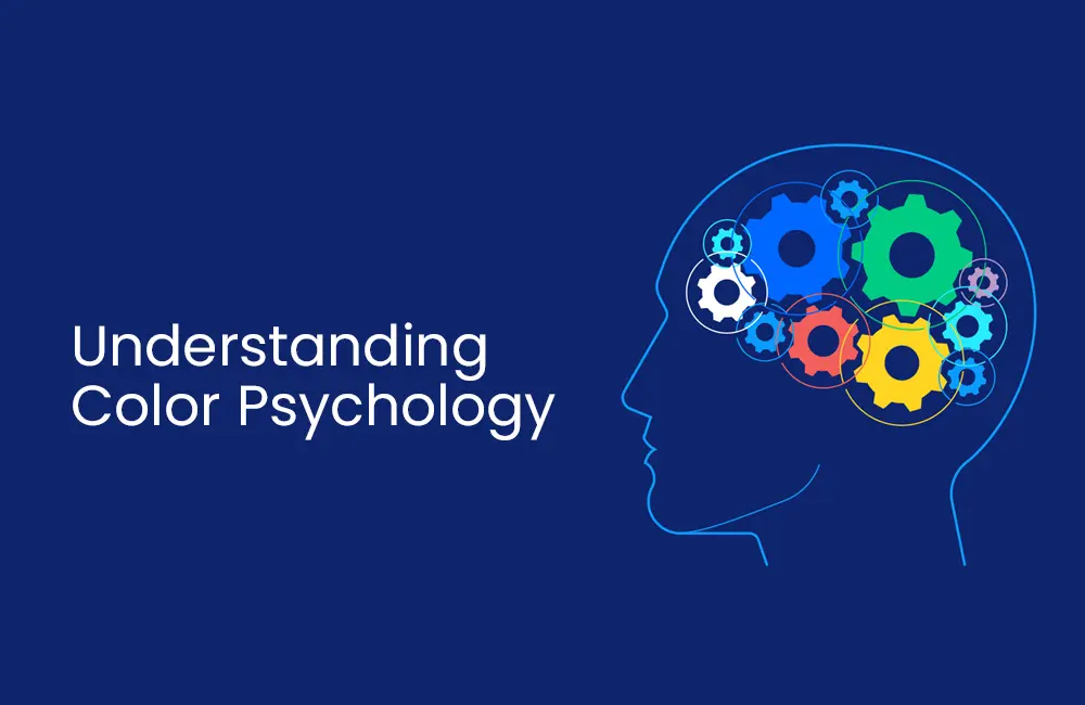
Color psychology is the field of study that explores how colors impact human behavior, emotions, and perception. It delves into the understanding that different colors have the power to evoke varied feelings and reactions in individuals. By comprehending these color associations, designers can create more effective and engaging user interfaces. Colors can be categorized into warm tones, cool tones, and neutral tones, each possessing its own unique meanings and influences.
When it comes to designing websites and user interfaces, color selection plays a crucial role. The colors used in a design can significantly impact how users perceive and interact with the interface. By strategically choosing colors based on their psychological effects, designers can create interfaces that effectively communicate messages, evoke desired emotions, and influence user behavior.
Warm colors, such as red, orange, and yellow, are associated with energy, excitement, and urgency. They can be used to draw attention to important elements or create a sense of urgency for specific actions, like making a purchase or signing up for a service.
Cool colors, such as blue, green, and purple, are often associated with calmness, trust, and relaxation. These colors are commonly used in industries such as healthcare or finance, where a sense of security and serenity is desired.
2. The Impact of Color on User Perception
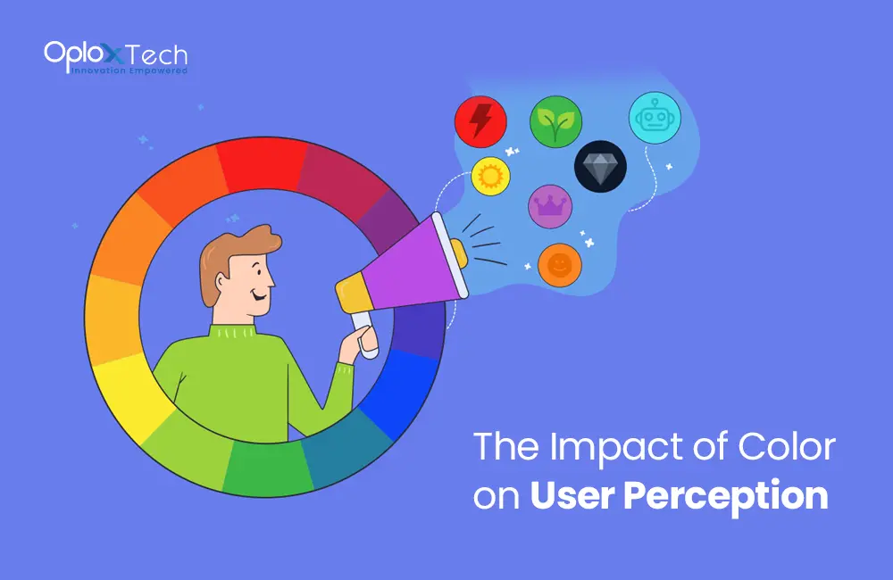
Colors wield a profound influence on how users perceive and interpret a website. The careful selection of colors can shape the user’s emotional response, convey specific messages, and influence their overall experience. When it comes to designing user interfaces, understanding the impact of color on user perception becomes crucial.
Additionally, different shades and tones of colors can evoke varying responses. For example, lighter shades of blue may convey a sense of serenity and peace, while darker shades can create a more mysterious or luxurious ambiance. It is essential for designers to consider the specific shade and tone of each color to align with the desired perception and message of the website.
By understanding the impact of color on user perception, designers can strategically choose colors that align with the desired emotional response and overall user experience. Whether it’s creating a sense of urgency, instilling trust, or evoking a particular mood, color selection plays a vital role in shaping user perception and enhancing the effectiveness of a website.
3. Creating a Harmonious Color Scheme

In the realm of UI/UX website design, the creation of a harmonious color scheme holds paramount importance. A harmonious color scheme not only enhances the visual coherence of a website but also contributes to a pleasant and engaging user experience. By employing various techniques such as complementary colors, analogous colors, or monochromatic palettes, designers can craft visually appealing and well-balanced designs that resonate with users.
Complementary colors are pairs of colors that lie opposite each other on the color wheel. When used together, they create a striking contrast that catches the eye and adds visual interest to the design. For instance, combining blue with orange or red with green can produce a visually captivating effect. Complementary colors are often used to highlight key elements, such as buttons or headings, and create a sense of vibrancy and excitement.
Analogous colors, on the other hand, are colors that are adjacent to each other on the color wheel. These colors share a harmonious relationship and create a sense of unity and cohesiveness in the design. For instance, combining shades of blue, green, and teal can result in a serene and balanced color scheme. Analogous colors are frequently used to establish a specific mood or theme within the design, such as a calming or energetic atmosphere.
4. Enhancing User Interaction with Color
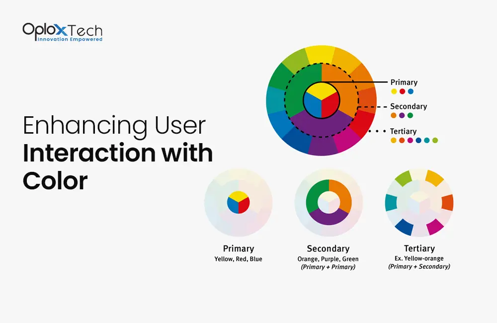
Colors are vital in guiding users and optimizing their interaction with a website. By strategically utilizing color, designers can make certain elements stand out and encourage user engagement, ultimately enhancing the overall user experience.
One effective way to enhance user interaction is by using a different color for clickable elements such as buttons or hyperlinks. By selecting a color that contrasts with the surrounding elements, designers can draw attention to these interactive elements, making them more noticeable and inviting to users. For example, using a vibrant shade of blue for buttons against a neutral background can create a strong visual contrast, prompting users to click and explore further.
Another technique to improve user interaction is by changing the color of visited links. When users click on a hyperlink and visit a new page, the color of the visited link can be altered to provide visual feedback. This simple yet effective method helps users keep track of the pages they have already visited, preventing them from revisiting the same content accidentally. By utilizing color in this manner, designers enhance user navigation and make the browsing experience more seamless and intuitive.
5. Color Psychology and Branding in UI/UX Design
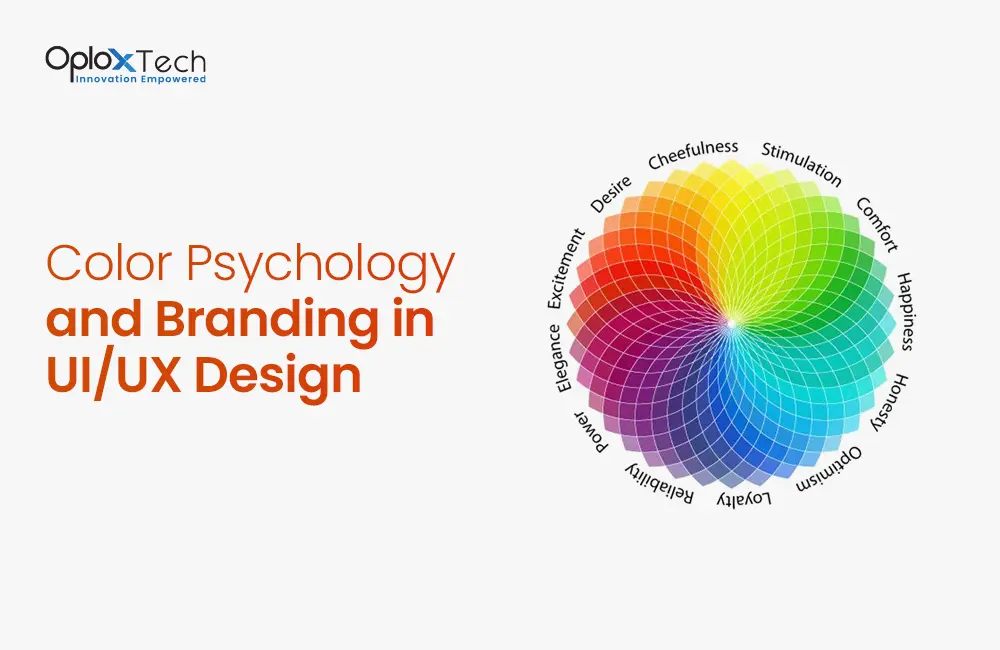
Color holds immense power when it comes to branding and creating a recognizable identity in UI/UX design. Consistency in color usage across a website not only enhances visual coherence but also plays a crucial role in establishing a strong brand identity. Companies carefully select colors that align with their values, target audience, and industry to create a distinct and memorable brand presence.
Color psychology, as discussed earlier, explores the emotional and psychological impact of colors on human behavior. By leveraging color psychology, designers can strategically select colors that resonate with their target audience and evoke the desired emotions and associations. When used consistently, these colors become synonymous with the brand and help create strong brand recognition.
In the realm of UI/UX design, color is an essential tool for expressing brand personality and values. Companies choose colors that reflect their brand’s essence and resonate with their target audience.
Read More: Improve User Experience with 10 Website Design Elements
Conclusion
Color psychology is a powerful tool in UI/UX website design. By understanding the impact of colors on user perception, creating harmonious color schemes, enhancing user interaction, and utilizing colors for branding, designers can create visually appealing websites that engage and captivate users. Remember, the right choice of colors can make a significant difference in how users perceive and interact with a website, ultimately leading to a successful user experience.
Moreover, you need not to worry, OploxTech knows exactly which color to use and when and for what purpose. Join hands with us and we will help you succeed.
FAQs
Q1. How can I choose the right colors for my website?
To choose the right colors, consider your target audience, industry, and the emotions you want to evoke. Research color psychology and experiment with different combinations to find the best fit for your website.
Q2. Can I use multiple colors in my design?
Yes, using multiple colors can add vibrancy and visual interest to your design. However, ensure that the colors harmonize well and do not overwhelm the user.
Q3. Are there any universal meanings associated with colors?
While colors can have general associations, their meanings can vary across different cultures and contexts. It’s important to consider the cultural background and context of your target audience when selecting colors.
Q4. Can color alone determine the success of a website?
Color is just one aspect of UI/UX design. While it plays a significant role, other factors such as usability, navigation, and content also contribute to the success of a website.
Q5. How can I use color psychology to improve conversions on my website?
By understanding the emotional responses associated with different colors, you can strategically use them to guide users toward desired actions. For example, using a contrasting color for a call-to-action button can make it more noticeable and increase conversions.
Incorporating color psychology into UI/UX website design can significantly impact the overall user experience. By leveraging the power of colors, designers can create visually captivating websites that resonate with users, evoke desired emotions, and drive engagement. So, the next time you embark on a website design project, remember to harness the potential of color psychology and create an immersive digital experience.


